Wonderland typography
This page lists the different fonts used throughout the Wonderland games.
Classic Trilogy
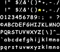
Nearly all of the text in the Classic Trilogy games is set in a version of Microsoft's Comic Sans in bold weight, modified to be monospaced. The primary differences between the in-game version and the original are:
- The percent sign uses dots (٪) instead of circles as in the original (%).
- The asterisk (*) is rendered as a small gold star. This is the only character in a color other than white.
- The bottom half of the semicolon is more curved and slightly closer to its top half.
The letterforms are all stored as bitmaps in the games' resource files, under the names fontpiece1.bmp through fontpiece6.bmp, with an additional file fontpiece1new.bmp which has the gold star instead of the asterisk as mentioned above. The order of the characters roughly follows standard ASCII order, with a few exceptions: the in-game version lacks the number sign (#), less-than sign (<) and greater-than sign (>), and the at sign (@) is rendered as a copyright symbol (©). It is unclear where the latter comes from, as it does not match the copyright symbol in the original Comic Sans font.
The Wonderland logo in the Classic Trilogy games is set in Adobe's Charlemagne.
Wonderland Adventures Trilogy
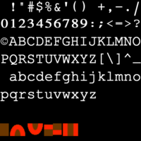
Most of the text in the Wonderland Adventures Trilogy is set in a combination of at least two fonts:
- The letters and most of the punctuation appear to be taken from some version of IBM's Courier, though it is unclear which one, as none of the best-known versions (IBM, Adobe, Monotype's Courier New, URW's Nimbus Mono, etc.) are exact matches.
- The numerals and exclamation mark appear to be taken from Linotype's version of Times, modified to be monospaced.
- The origin of the slash is unclear, as it does not match the corresponding glyphs in any version of either Courier or Times.
The letterforms are all stored in a single bitmap under the name gpou.wdf in the each of the games' Data folders. Like in the Classic Trilogy, the order of the characters follows the ASCII standard with the exception of @ being changed to ©. The three characters missing from the Classic Trilogy character set are present here, but this time the asterisk and grave accent are absent.
The early build used a different font. It was almost identical to the one used in the Classic Trilogy with the exception of the lowercase m, which was changed to be an upside-down lowercase w.
System-dependent fonts
In some contexts across the games, all of the text is rendered using a default system font, rather than one defined in the games' resource files. In most cases, this will be the raster version of Courier, available by default on all Windows systems. Such contexts include display settings screens, loading screens, certain error messages, the Wonderland Adventures Editor's level design view, and YEA.
If the user installs a vector font named Courier in addition to the existing raster font of the same name, the vector font will take precedence, and the text will be displayed at an extremely small size. In addition, the particular choice of font is locale-dependent: if the system locale is set to Bulgarian, for example, the text will similarly be very small,[1] and in some other locales, such as Hebrew, a different typeface may be chosen altogether.


